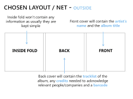
Front cover- The front covers usually has the title of the film and a picture that has a synergistic effect towards the music, its quite colourful as it has to grasp the attention of the customer, but sometimes it doesnt have to be colourful to fit the genre. The front cover is the first thing costumer sees. The front cover can most probably define the genre.
Spine- usually has the title and the name of te producer or artist. Colour scheme is followed from the front cover.
Back cover- It has the instituational information on the back but is still goes witht he colour scheme of the whole digipak. It also shows you the songs on the CD.
Internal panels- Hard casing to protect the CD goes with the colours on the rest of the digipak.usually one side is dedicated towards holding the CD while the otehr side either gives the somg list or a option to pull a booklet or a poster out.
Booklets/postcards/posters- Inside the digipak, you can pull it out and use it as a poster or if it is a booklet it shows you the insitutional information.
- A DigiPak is type of packaging for either a CD or DVD cover in order to promote the product inside
- It is another form of advertising and will be used in shops and online as the artwork for the product in order to create a link between this image and the artist/artists product
- It also gives details into the product including production company, copyright information, price or even little details such as for a CD, the lyrics, songs included on the disc and any other promotional material (posters)
The CD design shows a picture of many
used cigarettes, this matches the image
of the man smoking on the cover of the
album and suggests that he is not going by the rules and is a rebel to society.
This is the digipak front cover for the
album ‘Whatever People Say I Am That’s
What I’m Not’ by Indie band Arctic
Monkeys.
Unlike most digipaks, the name
of the album is not shown anywhere on
the front cover, suggesting the album is
aimed more at existing fans than new
fans audit gives a sense of arrogance as well as the fans who buy it should know the band anyway. Both images are in black and
white, and the
images are very plain and
simple, this along with
the title of the album
suggests that the band
doesn’t hide behind things,
As the
name of
the band is the only
text on the
page, it is
very eye-
catching
and easy
to see this makes it seem like they want their name heard and easily recognised.
The casual dress,
attitude and pose of the
man in the photograph
suggests a lack of care
for whatever anyone
thinks about him, and this
links again to the title The barcode and
record label copyright
information is shown
for retail and protection.
 |
| Back Cover |
 The track list for the album shows 13 tracks without numbers to signify in what order they should be, and this adds to the general feel of disorganisation and not having a care. The white text stands out against the black background and so can be easily identified by The images depicts the same person as seen on the front cover, giving continuity to the album. He is in the same clothes but in a slightly different pose: rubbing his eyes, which could suggest he has been up late working. The spines of the digipak are where we see the name of the album itself, and the font is exactly the same as the track listing which suggests continuity again.
\
 |
| Inlay |
Again, the label has been used but this time in the top left hand corner, which is where our eye initially gets drawn to, naturally. These are all acknowledgements to people who had anything to do with the album, such as band managers, producers, recorders, families and supporters. It also contains information of where the album was recorded and who designed the cover.


