Indie rock is a genre of alternative rock that originated in the United States and the United Kingdom in the 1980s. Originally "Indie" meant independent record labels and the music they produced. Indie was often used interchangeably with alternative rock.
The commercial breakthrough from these scenes was led by four bands: The Strokes, who emerged from the New York club scene with their début album Is This It (2001); The White Stripes, from Detroit, with their third album White Blood Cells (2001); The Hives from Sweden, after their compilation album Your New Favourite Band (2001); and The Vines from Australia with Highly Evolved (2002).They were christened the "The" bands by the media, and dubbed "The saviours of rock 'n' roll", leading to accusations of hype. A second wave of bands that managed to gain international recognition as a result of the movement included The Black Keys, Black Rebel Motorcycle Club, Modest Mouse, The Killers, Interpol and Kings of Leon from the US.
Friday, 22 September 2017
Thursday, 21 September 2017
Post production.
Post production has allowed the opening to become more faced paced and make more sense. Without the post production it would just be long takes of me running around hounlose heath. But with it i can make the product more realistic and have a stoey to it.

Post production has allowed the opening to become more faced paced and make more sense. Without the post production it would just be long takes of me running around hounlose heath. But with it i can make the product more realistic and have a stoey to it.
Here are all the clips we used for our final opening cut. These are un-edited.
Here is our actual thriller opening that was edited
Here is the finished edited thriller opening in Final Cut Pro
Audio
Video
Credits

This shows how my audio, visual audio, titles line up. As you can see with the use of final cut pro we are able to cut and crop shots to the legth we need it to be. It also allowrd us to import uncopywrited music and we went for a sisnister but fast paced song which with the help of ediding at critial moments in the opening the music goes with the tempo of the shots. Also in editing we could add titles for our film and creditis this makes it seem more real to an audience and more proffesional.
Creativity
I think we created a product that customers can consume quite easliey. We made ideas on how we would adveritse it. Like a bus shelter or a figiatl banner. I thinl we were creative in many ways one being props we used.
Our mini flim was creative becasue we made it like a sifi film.
Our mini flim was creative becasue we made it like a sifi film.
Friday, 15 September 2017
Use of digitisal technology:
Pre-Production:
creating the blog helped us research ways in which other openings are made and what we had to do to make our film. i used digidtal technology like youtube to view trailers to thrillers and also used a dsl camera to film our openings.
Websites we used were imdb, rotten tomoatoes, spectres offical website, suffregettes offical website, and youtube.
I anaylised all the offical websites to see hoe they advertise the films and how they linked with their target audience using social media such as Facebook and twitter, this helped me construct my post becasue it showed me the offical trailers of the films that i researched. And i also made two 9 frame anaysi of deadpool and skyfall. This helped me in my pre production stage becasue it showed me hoe the music has to be in time and thr diffrent shots i could get.
I used digiatl techomlogy such as 1websites that helped me create anamatics of diffrent shots for the plan. Also i used final cut pro to create audio clips of my group talking though the plan with a audience. We also got a few people to watch two trailers and tell us what they liked and disliked about itm we videoed them answering in the blog. This helped us construct my product as we got feedback from viewers and we took that into c9nsideration while planning our opening.
Production:
Throughout the production process we used a variety of different types of technologies.
The equipment we used included:
The equipment we used included:
- Canon DSL 650 D
- iMac
- Mic
The softwares we used were:
- Final Cut Pro
- Blogger
Canon DSL 650 D
Pros:
- 18 Megapixels allowed High Quality visuals.
- Main equipment used to capture opening thriller film.
- Taught beforehand so quite simple to construct, in terms of white balance and which buttons to press to video.
- Lens allowed focus for greater definition .
- The range of lighting it offered was very useful.
Cons:
- Battery life was an issue for us since we ran out of battery near the end of shooting, however we recharged it quickly.
- The menu on the camera were initially slightly confusing to comprehend, but eventually got used to it.
- The mic on the camera was quite weak, although we used a small boom mic to help us.

Conclusion:
Using this camera, I learnt a lot of things such as how to hold it in a tripod, enhance lighting, white balance and filming with it in general. The process of learning how to use it was very interesting. It was a great experience since I had never used a Canon to video something before.

Imac:
Pros:
- Used in 2 production processes - pre and post production.
- Used to edit final product.
- Used for research.
- Auto-saved everything.
- Occasionally the Macs crashed and froze, however I think it was the softwares itself that froze - to solve this issue we patiently waited or just logged onto a new Mac.
Conclusion:
The iMac was one of the most vital equipment in the process of pre-production and post production. I learnt many things such as the new softwares like Final Cut Pro and Blogger that i had not had any experience with before this task.
Mic:
Pros:
- Enhanced our thriller by blocking out most background noise and focusing on our character's dialogues.
- Professional mic.
- Easy to attach on and remove from camera.

Cons:
- Sometimes we could still hear some background sounds.
- The mic was a pain too carry as well as everything else.
Conclusion:
The mic was pretty new to our year so we all were excited to use it. It really helped us in our production as it improved the quality of our footage.
Final Cut Pro:
Pros:
- Used to edit any footages that were to be put onto YouTube for our blog - e.g. interviews, focus groups interviews and our thriller!
- Simple concept, in terms of cutting and editing a single footage.
- Worked well on Macs.

Cons:
- Sometimes froze when added too many footages
- Takes a long time to render.
- Quite difficult to cut to the exact spot you want to cut to - to solve this issue I zoomed closer into a single footage and cut to the spot I needed to.
Conclusion : This is the software that ultimately puts everything together and without it we would be unable to get rid of snippets that we didn't want in our final clip. Overall it was really good to use apart from when it randomly decided to close itself.
Blogger:
Pros:
- Used in all 3 production processes
- Easy to blog on.
- Able to alter time and date to have an organised group navigation bar.
- Able to upload things from a variety of websites, such as YouTube, Prezi and Soundcloud.
- Proof of work the group and I has done individually.

Cons:
- The images sometimes don't lay where I want them to be - however, I attempt to place it elsewhere where it would look just as presentable.
- Having to embed codes is quite long - but, I began to get used to it.
Conclusion : It was good to use and made it easy for us to post everything on to. It was also another place for us as a group to communicate as we were constantly using it and updating our posts.
Post production:
This helped me construct myfinal product as a group we could add effects sounds and cgi to the video we put together. We mostly had faced place scenes so we used final cut pro to aid us in editinf the video and making it jumpy.
This helped me construct myfinal product as a group we could add effects sounds and cgi to the video we put together. We mostly had faced place scenes so we used final cut pro to aid us in editinf the video and making it jumpy.
Monday, 11 September 2017
Summer Research: online identity
ZOELLA ONLINE IDENTITY

The design of Zoella's homepage has very feminine colours and writing. Her name in the top left is a very fancy and curly font this could show she is going for a younger feminine audience.
The option bar is pink again showing a more feminine audience. Also there are little digital lights that light up that shows that she is going for a younger audience , also for a younger audience there is a lot of interactive buttons that light up when you hover your mouse over it. This allows the audience to interact with her website which entices a younger feminine audience.

 Each topic like beauty, food, life, places, style ,shop loads of other smaller subjects attached to it. This makes the homepage easy to find other content on her blog. As soon as you go on the website you can chose a main title and then click onto subtitles to see or read what you want.
 To the left is a photo of the life section and its different sub options this gives a Varity of options to choose from and it shows how she puts effort into her blog as well as her other content like social media and YouTube.
She has links to many different media that she has including her Pinterest, Facebook and YouTube. which shows she is crossing over her different type content she has. The icons for the other content options are small and child like which get a younger audicince to click the button opening up the link to her social media, which means the audience will be lead on to watch that thing.
She talks aboit subkects like anxiety and beauty whichs shows shes going for a girly teenage target audience. But using a blog she can spread her demographic to others as well as she talks about life and food and style.
If she didnt have a blog it would be her Youtube channel which is bascially make up but by using a blog she can have a varity of people.she can share her content with gradually builing up a fan base and becoming more popular.
Having a blog is having all your content into one and can help her fans guide themselves through her media and work.
Thursday, 8 June 2017
Digipak research and planning
1. Elements of real digipak:
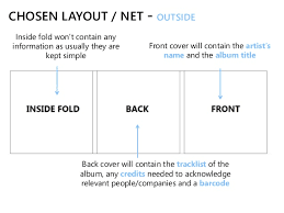
Front cover- The front covers usually has the title of the film and a picture that has a synergistic effect towards the music, its quite colourful as it has to grasp the attention of the customer, but sometimes it doesnt have to be colourful to fit the genre. The front cover is the first thing costumer sees. The front cover can most probably define the genre.
Spine- usually has the title and the name of te producer or artist. Colour scheme is followed from the front cover.
Back cover- It has the instituational information on the back but is still goes witht he colour scheme of the whole digipak. It also shows you the songs on the CD.
Internal panels- Hard casing to protect the CD goes with the colours on the rest of the digipak.usually one side is dedicated towards holding the CD while the otehr side either gives the somg list or a option to pull a booklet or a poster out.
Booklets/postcards/posters- Inside the digipak, you can pull it out and use it as a poster or if it is a booklet it shows you the insitutional information.
 Retailers: Before iTunes and Spotify and all the music streaming sites became popular hmv was the most popular retail store for music on the high streets. Places like HMV would sell their music in digipaks or vinyl. Nowadays digipaks are becoming out of fashion and vinyl and digital music are being used more frequently.

 The track list for the album shows 13 tracks without numbers to signify in what order they should be, and this adds to the general feel of disorganisation and not having a care. The white text stands out against the black background and so can be easily identified by The images depicts the same person as seen on the front cover, giving continuity to the album. He is in the same clothes but in a slightly different pose: rubbing his eyes, which could suggest he has been up late working. The spines of the digipak are where we see the name of the album itself, and the font is exactly the same as the track listing which suggests continuity again.
\
The song titles are structured to go with the shape of the mans head which adds visual structure to the layout. The main central picture is again of Chris McClure. He represents the album and the genre of indie music as he seems really intoxicated or drugged up, which relates to indie audiences.
Again, the label has been used but this time in the top left hand corner, which is where our eye initially gets drawn to, naturally. These are all acknowledgements to people who had anything to do with the album, such as band managers, producers, recorders, families and supporters. It also contains information of where the album was recorded and who designed the cover.

Front cover- The front covers usually has the title of the film and a picture that has a synergistic effect towards the music, its quite colourful as it has to grasp the attention of the customer, but sometimes it doesnt have to be colourful to fit the genre. The front cover is the first thing costumer sees. The front cover can most probably define the genre.
Spine- usually has the title and the name of te producer or artist. Colour scheme is followed from the front cover.
Back cover- It has the instituational information on the back but is still goes witht he colour scheme of the whole digipak. It also shows you the songs on the CD.
Internal panels- Hard casing to protect the CD goes with the colours on the rest of the digipak.usually one side is dedicated towards holding the CD while the otehr side either gives the somg list or a option to pull a booklet or a poster out.
Booklets/postcards/posters- Inside the digipak, you can pull it out and use it as a poster or if it is a booklet it shows you the insitutional information.
- A DigiPak is type of packaging for either a CD or DVD cover in order to promote the product inside
- It is another form of advertising and will be used in shops and online as the artwork for the product in order to create a link between this image and the artist/artists product
- It also gives details into the product including production company, copyright information, price or even little details such as for a CD, the lyrics, songs included on the disc and any other promotional material (posters)

The CD design shows a picture of many
used cigarettes, this matches the image
of the man smoking on the cover of the
album and suggests that he is not going by the rules and is a rebel to society.
This is the digipak front cover for the
album ‘Whatever People Say I Am That’s
What I’m Not’ by Indie band Arctic
Monkeys.
Unlike most digipaks, the name
of the album is not shown anywhere on
the front cover, suggesting the album is
aimed more at existing fans than new
fans audit gives a sense of arrogance as well as the fans who buy it should know the band anyway. Both images are in black and
white, and the
images are very plain and
simple, this along with
the title of the album
suggests that the band
doesn’t hide behind things,
As the
name of
the band is the only
text on the
page, it is
very eye-
catching
and easy
to see this makes it seem like they want their name heard and easily recognised.
The casual dress,
attitude and pose of the
man in the photograph
suggests a lack of care
for whatever anyone
thinks about him, and this
links again to the title The barcode and
record label copyright
information is shown
for retail and protection.
 |
| Back Cover |
 The track list for the album shows 13 tracks without numbers to signify in what order they should be, and this adds to the general feel of disorganisation and not having a care. The white text stands out against the black background and so can be easily identified by The images depicts the same person as seen on the front cover, giving continuity to the album. He is in the same clothes but in a slightly different pose: rubbing his eyes, which could suggest he has been up late working. The spines of the digipak are where we see the name of the album itself, and the font is exactly the same as the track listing which suggests continuity again.
\
 |
| Inlay |
Again, the label has been used but this time in the top left hand corner, which is where our eye initially gets drawn to, naturally. These are all acknowledgements to people who had anything to do with the album, such as band managers, producers, recorders, families and supporters. It also contains information of where the album was recorded and who designed the cover.

Monday, 23 January 2017
Subscribe to:
Comments (Atom)